Building a website presence is not exactly a field of dreams where “if you build it, they will come”. After all, just about everyone now has a website, but not everyone has a website that is getting traffic.
To truly make an impact online you need a website that adheres to best practices, and your site needs to be designed and developed in such a way that it attracts and engages your target audience.
In this post, we are going to share some of the most common website design mistakes we see so that you can be sure to avoid them.
1) Respect the Norm:
Most people want to stand out with a crazy idea in an effort to seem different, or edgy. While it is good to be different, it is not wise to break all conventions in the process. Stray too far from the norm and you may just end up with some bad website design features that prevent you from getting the traffic you desire.
Jakob’s Law of the Web User Experience states that users spend most of their time on “Normal” websites. This means that they are used to a certain formula both in layout and design. Breaking all conventions will ultimately alienate your target audience and lose your customers in the process.
2) No SSL Certificate:
Not having an SSL Certificate was not a big problem a few years ago, but today, it is like telling search engines “just go ahead and ignore me”. It does not matter if you are asking for personal information, or selling products on your website. Google and several other search engines rank you lower if you do not use an SSL Certificate. Even worse, they may pop-up the dreaded “The site you are to trying reach is not secure” message. Using an SSL Certificate is essential.
3) Slow Loading Websites:
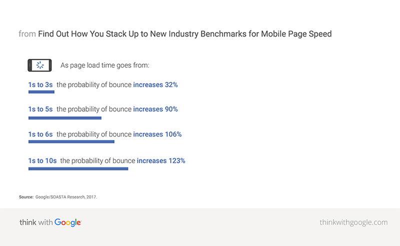
How long will you wait for a page to load before hitting the back button? Does it take 10 seconds for your site to load or just 5 seconds? Believe it or not, 47 percent of your visitors expect a page to open in 2 seconds. They are even more demanding on phones, with 53% expecting pages to load in 2 seconds or less. If your site is not fast, your visitors will abandon it for an alternative resource, and your website’s bounce-rate will suffer as a result.
Here are a few free tools that can help you determine if your website has slow load time and provide some insights on how to correct any issues.
4) Non-Responsive Websites:
In 2019 you can’t afford to make the mistake of ignoring a responsive website. According to a White Paper discussed on www.comscore.com from December 2013 to December 2015, internet consumption on tablets grew by 30% and Smartphones by 78%. Additionally, desktop internet consumption in the same period dropped by 1%.
All of these stats lead to one simple conclusion, while your website may focus on desktop internet users, equal importance needs to be given to designing an intuitive mobile-friendly version of your website. However, mobile-friendly versions of your website need to be equally well designed and enticing.
5) Video Over Plain Text:
Users often prefer video over graphics. In a report by Adobe titled “The State of Content: Expectations on the Rise” emphasized some important findings related to video content. Given a 15 minute time window, about 66% of the population would prefer watching a video over reading lengthy content.
6) Heavy Images, Graphics and Multimedia:
While we are on the topic of mobile-friendly web design, an extension of an age-old trend needs to be considered. Images, graphics and multimedia used cannot be too heavy for the page to load.
While this is a given for desktop access, it is even more critical for portable smart device access. On the go, users tend to have less time and patience. According to a survey result published Adobe over 50% of users polled said they would stop viewing video content if it took to long to load.
So two lessons here:
- First, ensure suitable videos or infographics are included to communicate key information.
- Second, ensure that the video or infographics elements you add to your site are easy to load on any device.
7) Missing Header Tags:
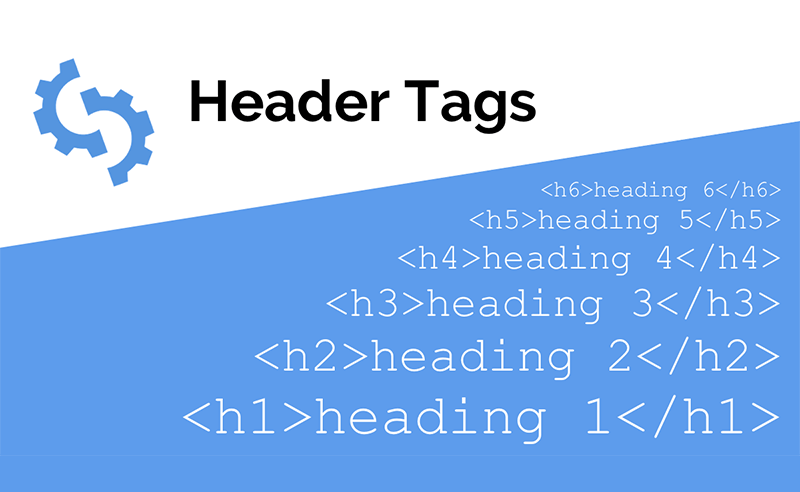
 H1 Headings and H2 Subheadings are crucial. These headline elements determine if your visitors will scan further down your page. The subheadings let them quickly scan the page to make sure the content is what they are looking for. When your website headings and subheadings match the user’s search intent, it encourages them to start reading the accompanying content. It is part of providing great user experience and keeps the user on your page longer.
8) Hiding Your Contact Info:
We scratch our heads when we cannot easily find contact information on a website.
64% of people who visit your website are wanting your contact information. It needs to be easy to find, and easy to use. Your websites goal should be to convert visitors into customers. If they cannot find a way to contact you, they will find someone else to do business with. Make sure your phone number, address, contact forms, and other contact information are easy to find, so you don’t lose a potential customer.
9) Links Should Open In New Tabs, Not New Windows:
This suggestion jumps right back into the user experience arena. Your users expect your links to open in a new tab, not a new window. When you set your links to open in a new window, not only does this provide a poor experience to the user, it also encourages users to navigate away from your website altogether.
10) Incompetent Color and Contrast:
Do not make the mistake of random color and contrast selections that can spoil all your hard work. Color and contrast combinations can make or break your website. Even the best designs will be rendered ineffective if the proper attention isn’t paid here. While Color theory has many implications in both print and web, breaking it down to its simplest parts it’s really just the complementary synergy of color and design. If you need a good primer on Color Theory, especially as it relates to the web, I recommend reading the article “A Simple Web Developer’s Color Guide” by Laura Elizabeth
11) Schema Markup:
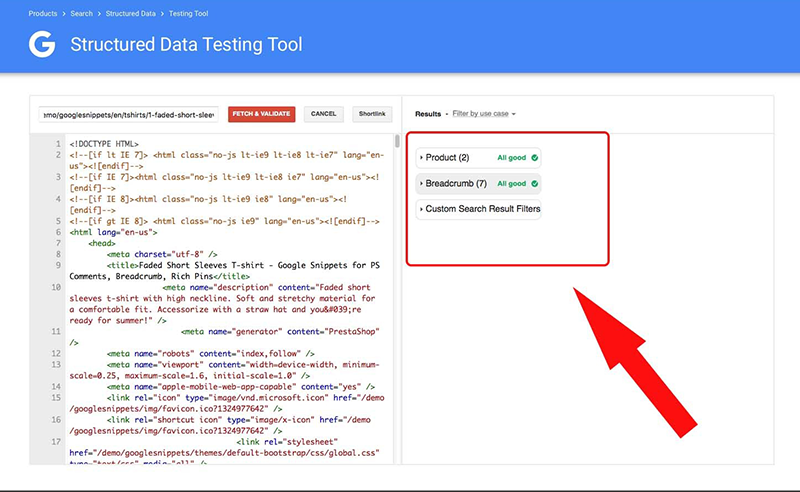
Make sure your site is using schema markup. Schema markup is a code framework you add to your website which provides search engines with added context on your page. It offers the ability to present more information to users who are looking for solutions and answer in Google.
 If you are new to schema markup I suggest taking a look at an article by Rebecca Sentance called “The complete beginner’s guide to Schema.org markup”
12) Don’t Dodge the Bullet:
According to data published by the Nielsen Norman group, about 70% of audiences would read a bulleted list, compared to only 55% who would read a simple article. While designing your web page, look carefully for ways to incorporate bullet points.
Conclusion:
When building your website, it’s imperative to consider all the factors that will determine its success. From color theory to layout design, it’s important that your website is engaging and usable and built with your audience in mind. Simply staying ahead of the curve and ensuring your website adheres to best practice, is likely the thing that will propel your website above the competition.
